There's been a rally in gold and silver since last we spoke, and my educated guess is that it has provoked and inspired a lot of chatter on the net that the tide has turned, gold is finally headed to $2000, etc.
Now, regarding the online chatter from the usual suspects, that's only a guess, since I haven't been online recently. Truth be told, I don't have a computer. Can't afford one. I'm currently at the public library next to the Beckley, West Virginia Hooters. (Speaking of which, I love hearing the laughter of children, but not when I'm eating French fries at Hooters. I might have to start looking elsewhere to dine.)
Anyway, the next long term bull cycle in the PM market is not here yet, but I'm seeing this August as a legitimate candidate for a final bottom. You heard it here first. But since that's still months away, here are some charts to keep you guys busy. I'm gonna get right to it here, as my hour at the public library is just about up.
The situation in gold hasn't changed since my last post. Outlook bearish until $1250 can be cleared. But there are so many different lines and curves of resistance there, I don't see it happening. For example, here's a chart I haven't pulled out in a while: the 89-week (Fib) moving average (green), the breaking of which augured the April 2013 crash
Here's a similar chart to the one from my last post. Like the 2-year MA, the 21-month (Fib) MA is right at $1250 too ...

The "yields in silver" chart is snaking towards the wedge....

Note GDXJ has popped out of its 3-sigma bollinger band for the first time since its inception. We see that a lot - fairly obvious short covering rally. Yet- it's barely gone up 5%

I like to pull this one out periodically: the 300-day MA in gold is an important indicator. Where is it, you ask? Why, at $1250 ...
Some good news here, showing on these very long term monthly three-line break charts, the cycles in the PMs are turning. Maybe Martin Armstrong is right ... good catch, Gary.
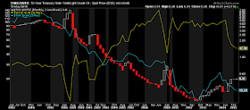
The two charts below tell me that interest rates, oil, and gold are all headed down in the next few months, and in that order of steepness. They may tell you something different, and that's okay.
Here's the inverse of a good index of consumer confidence. Obvious where it's headed -- the horizontal green/red line. Note there's a bit of a lag but gold follows it well -- e.g. check the small chart below with its 50-day MA (blue) vs. gold
UPDATE:
The astute among you may have noticed that the above chart was frozen at December 2014. Which gave me an opportunity to test my prediction. . . . . .
Damn I'm good!
But note the 50-day MA (blue) hasn't turned yet. That's what we're waiting for, and gold should follow. . .
Commodities have never been cheaper vs. stocks, and the ratio has never fallen so fast. I'm not basing any trades off of this but it's pretty amazing.
3 weeks ago, the 3-line break chart that has been damn near perfect in signaling intermediate term bull and bear cycles in silver reversed. I had a silver short open at the time, which I closed. I'll say it again, this chart is legit.

GM


Thanks for the charts GM. The 3 line break chart for gold is interesting, highlighting gold's resilience in recent times.
ReplyDeleteYields in silver nearly got to the line again recently, but has backed away. The 1.5 ratio (I reckon) will be hit when equities have one final leg up after a troubled summer, but that is just my gut feeling, nothing more.
A few more months to grab the last cheap ounces....
Good luck.